Role
Senior Designer
@ Gretel
Senior Designer
@ Gretel
2022
Branding
Microsite
Branding
Microsite
96 KING STREET
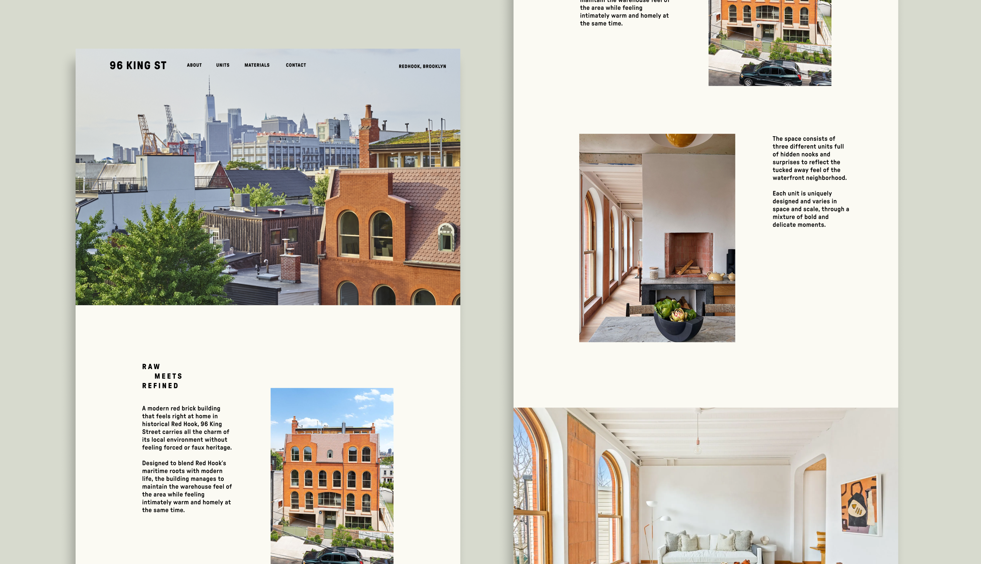
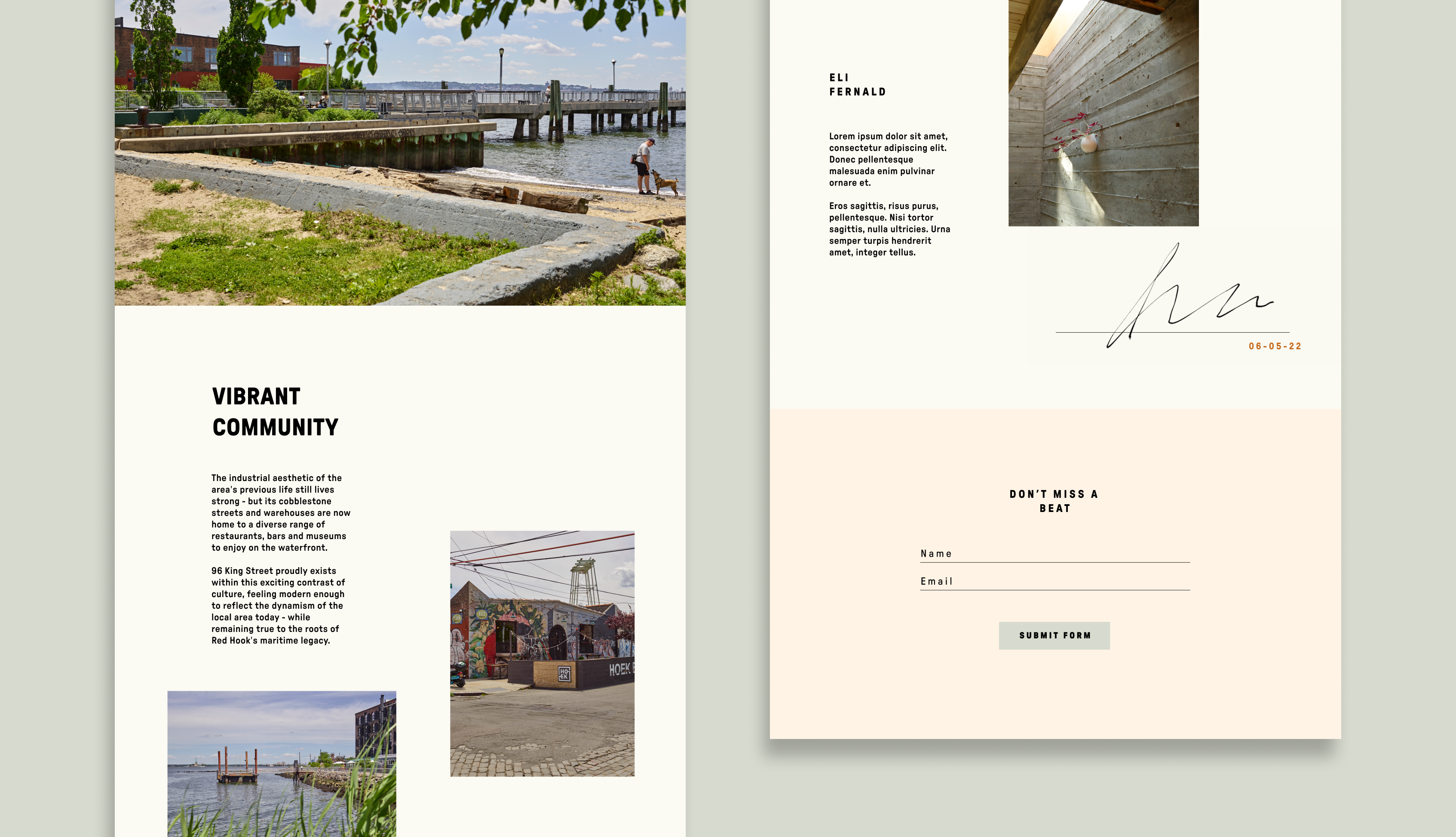
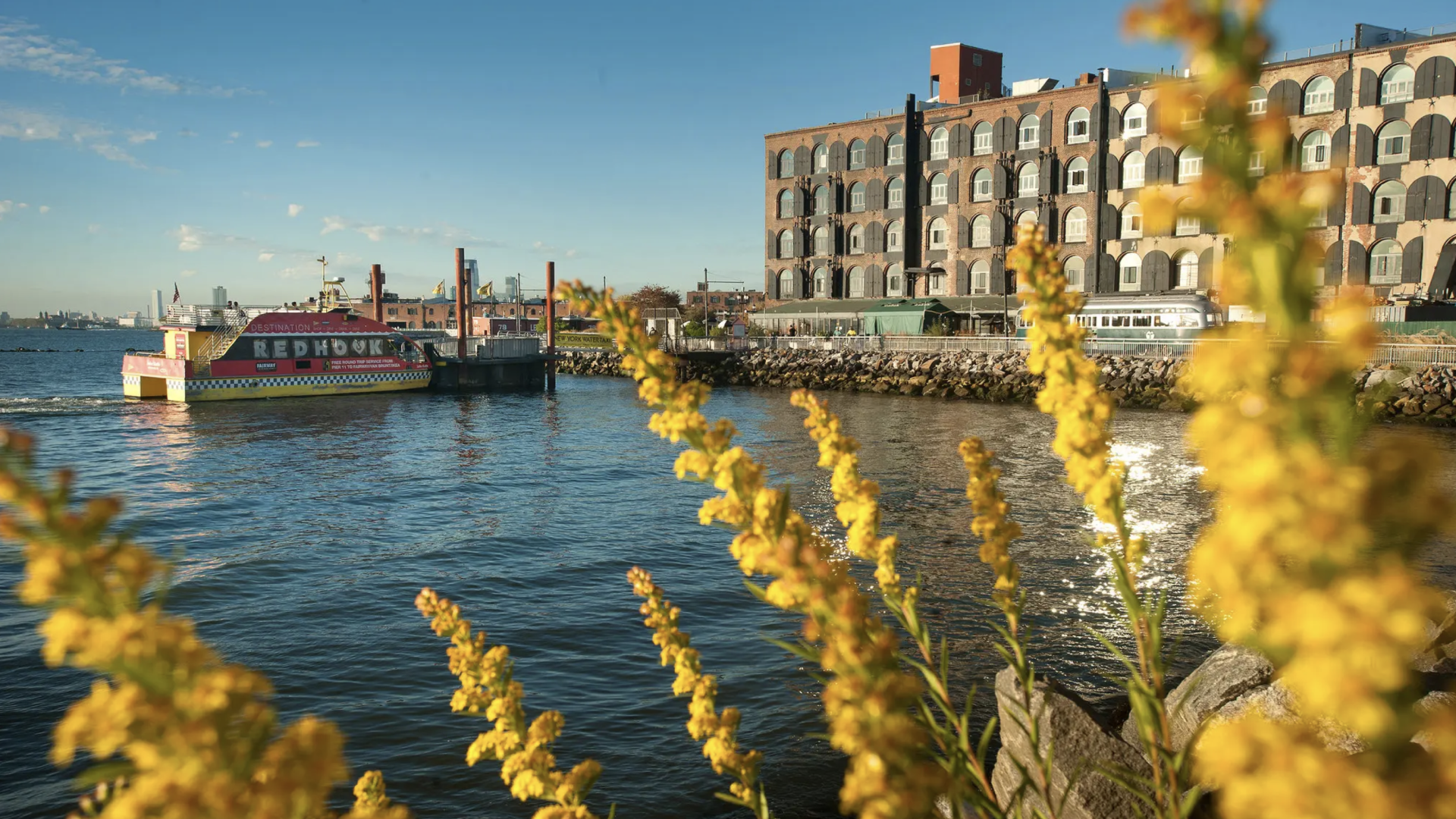
As a pro-bono project, I was part of a small but mighty team assembled at Gretel to create the branding and microsite for a new luxury condo in Red Hook Brooklyn.
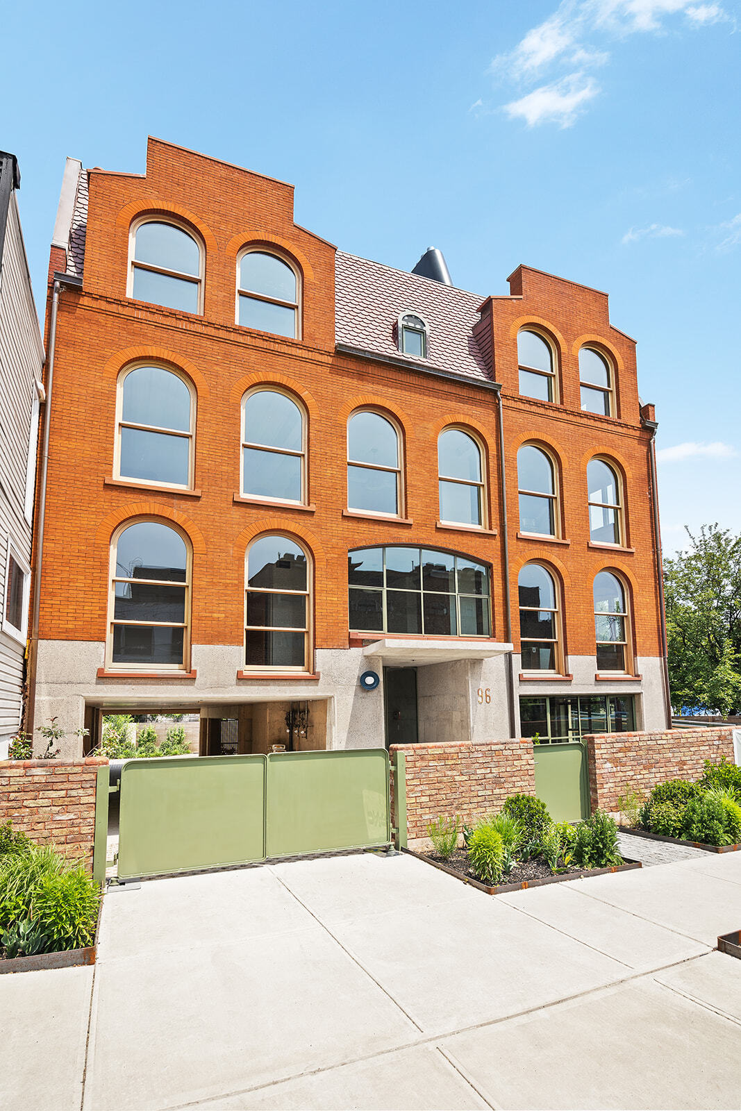
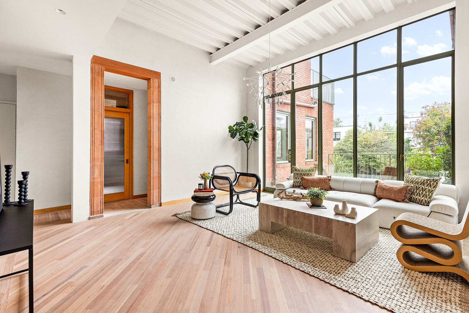
It was a privledge to work on a hospitality project and also to showcase Eli Fernald’s unique approach to interior design and architecture. The 3-unit building holds three distinctly unique floorplans that offer a rustic but elevated way of life.
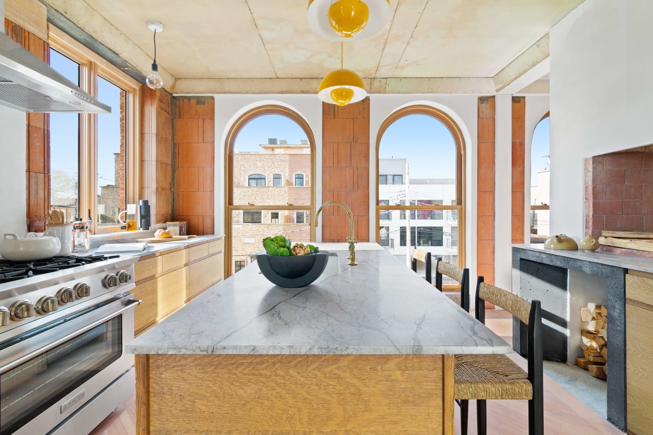
Brutally Beautiful
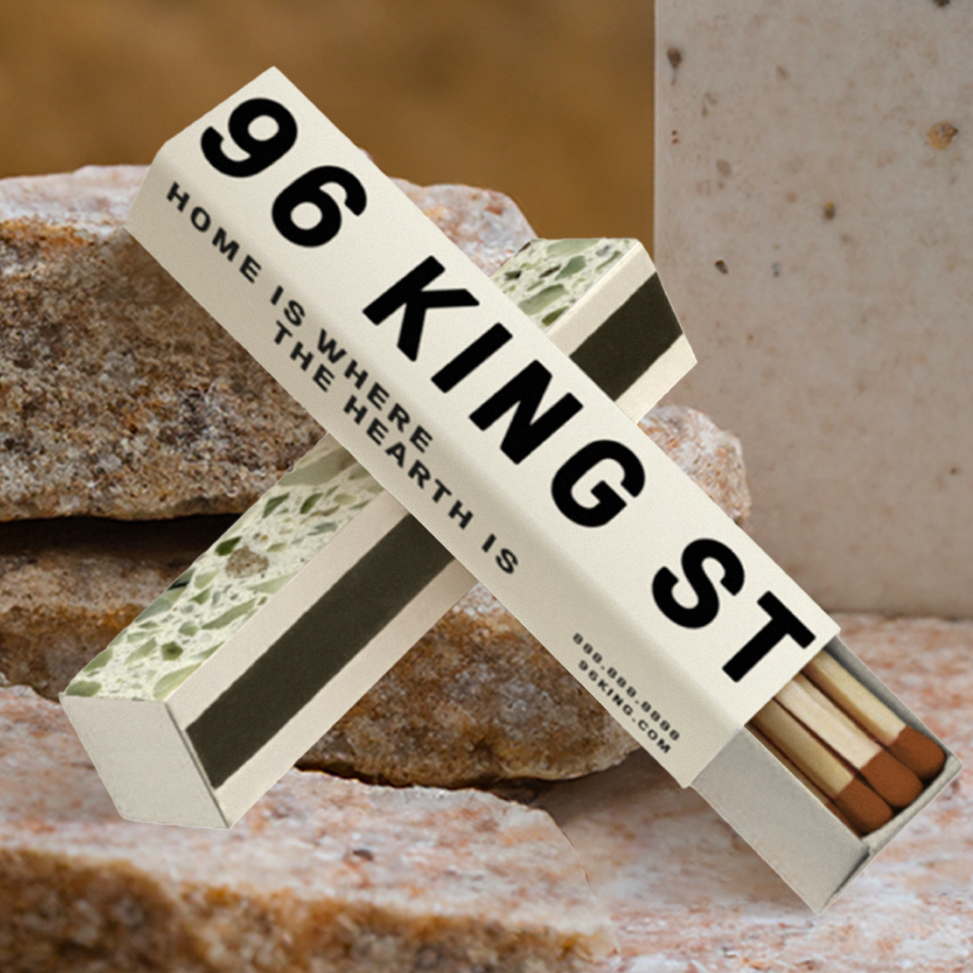
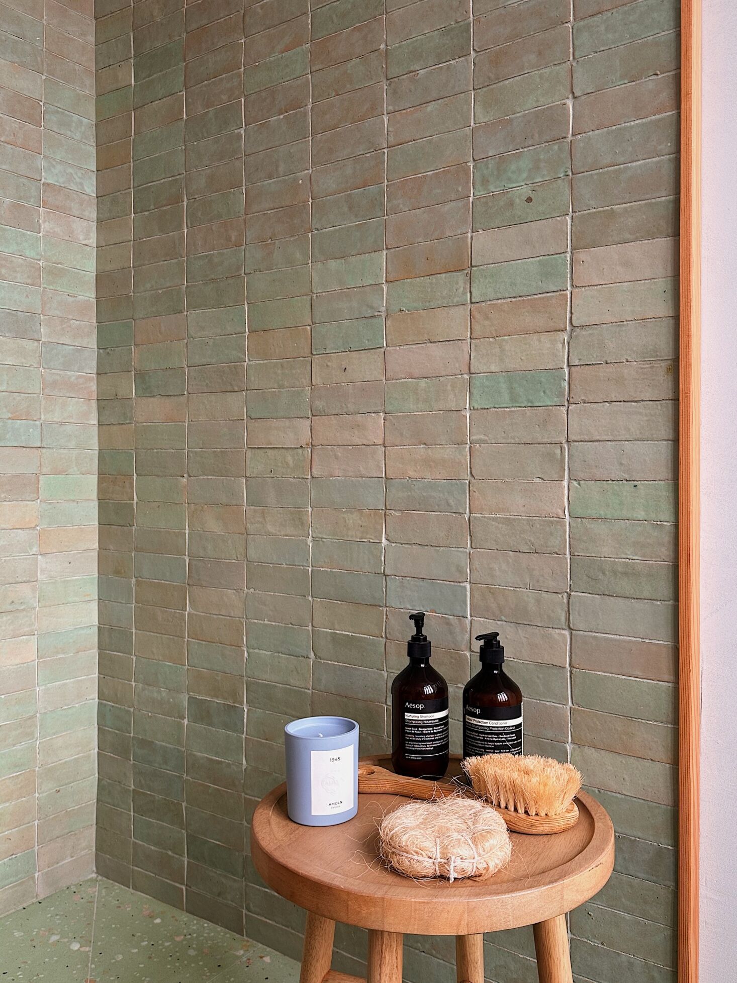
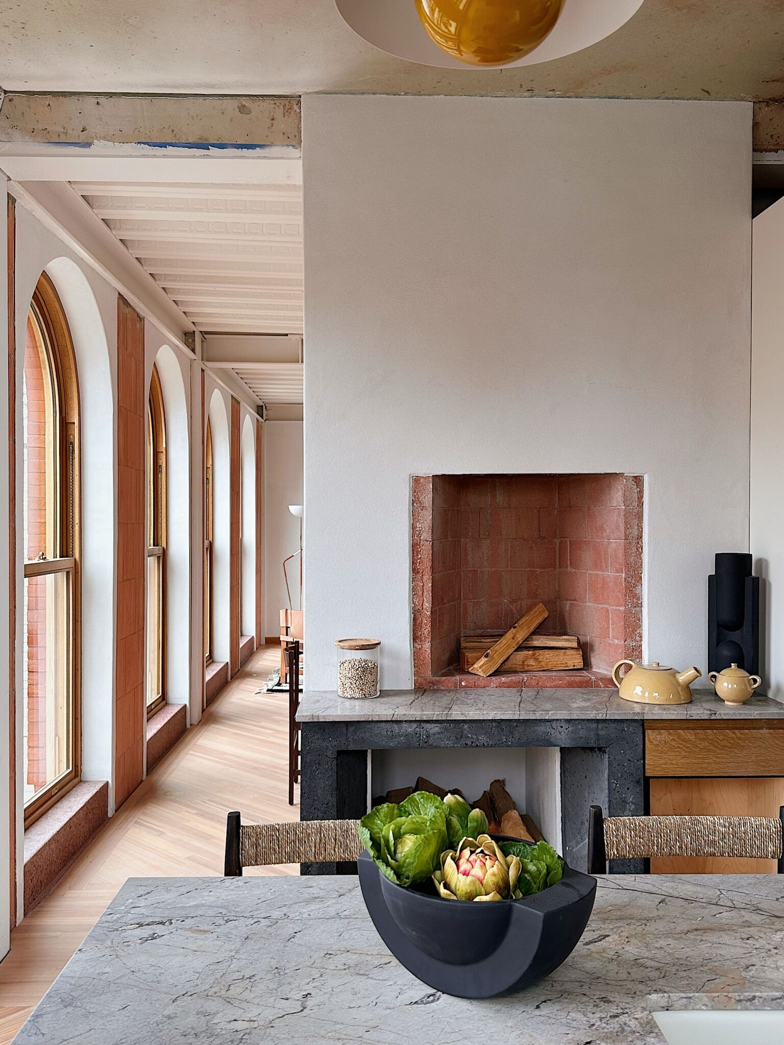
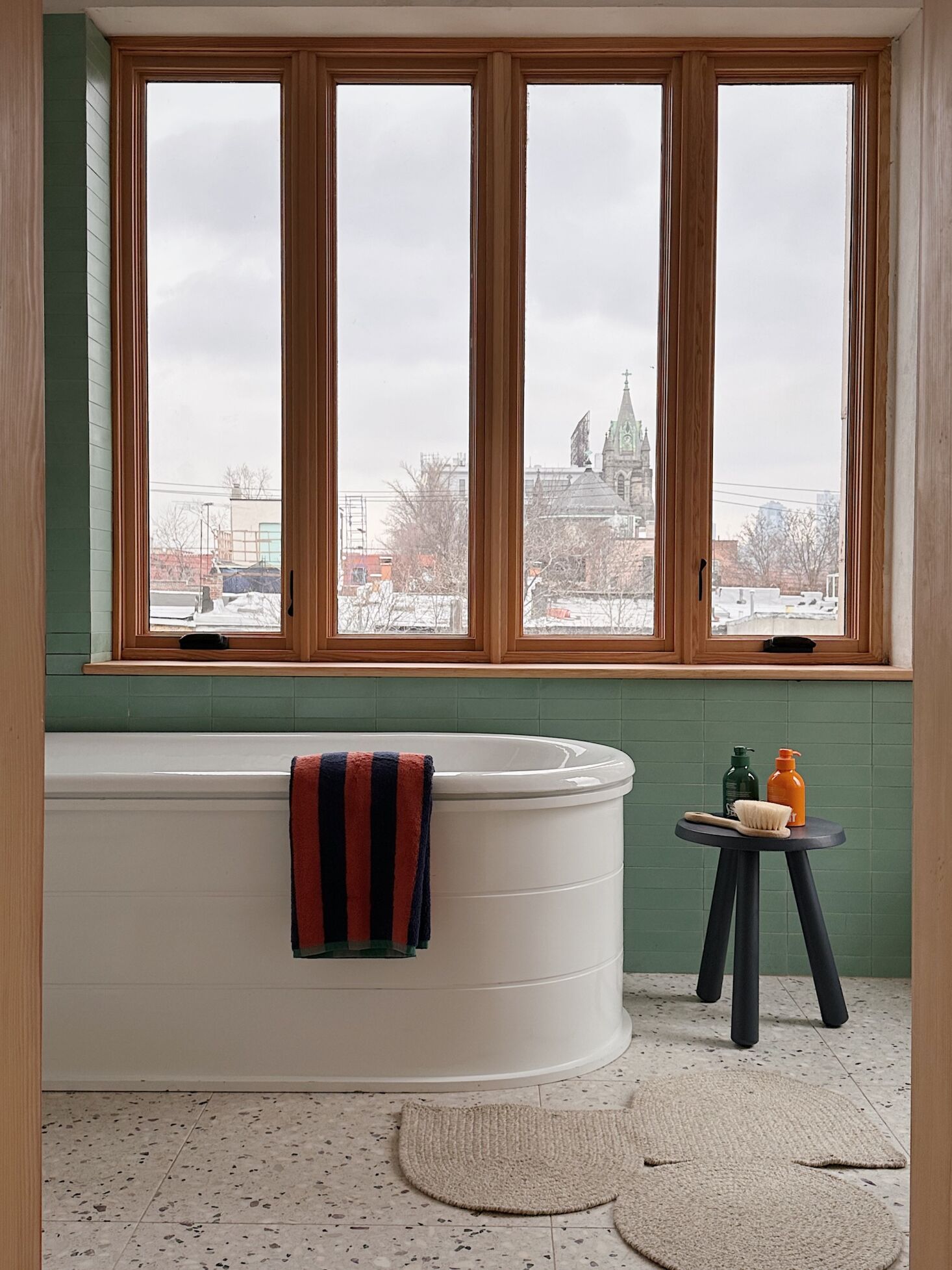
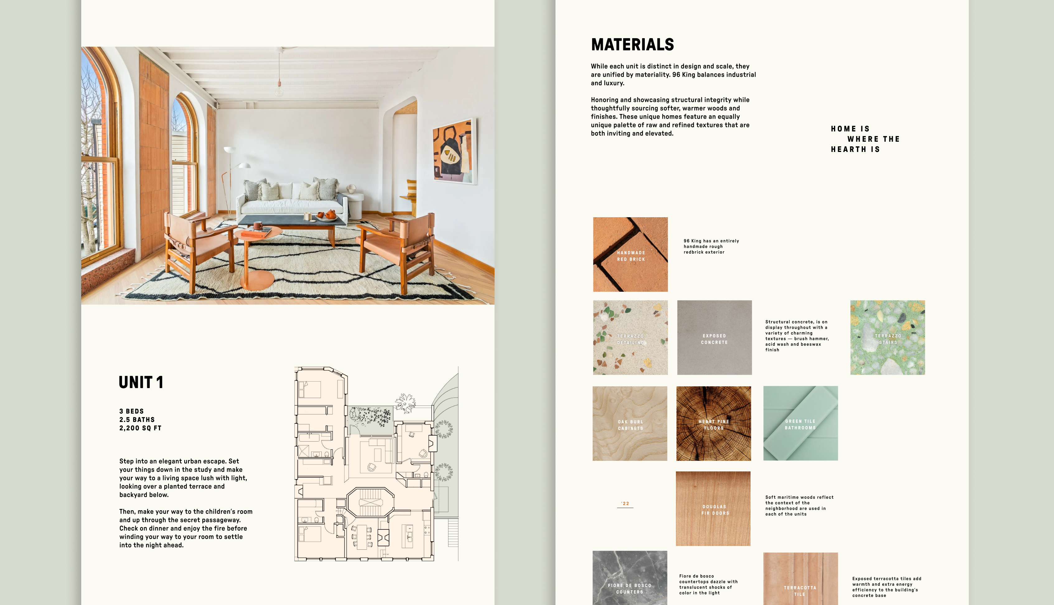
Our branding was heavily influenced by the materials used in the construction. Exposed terracotta, pink and green terrazzo, and wood-burning fireplaces together create a very warm and craftsman-inspired atmosphere.
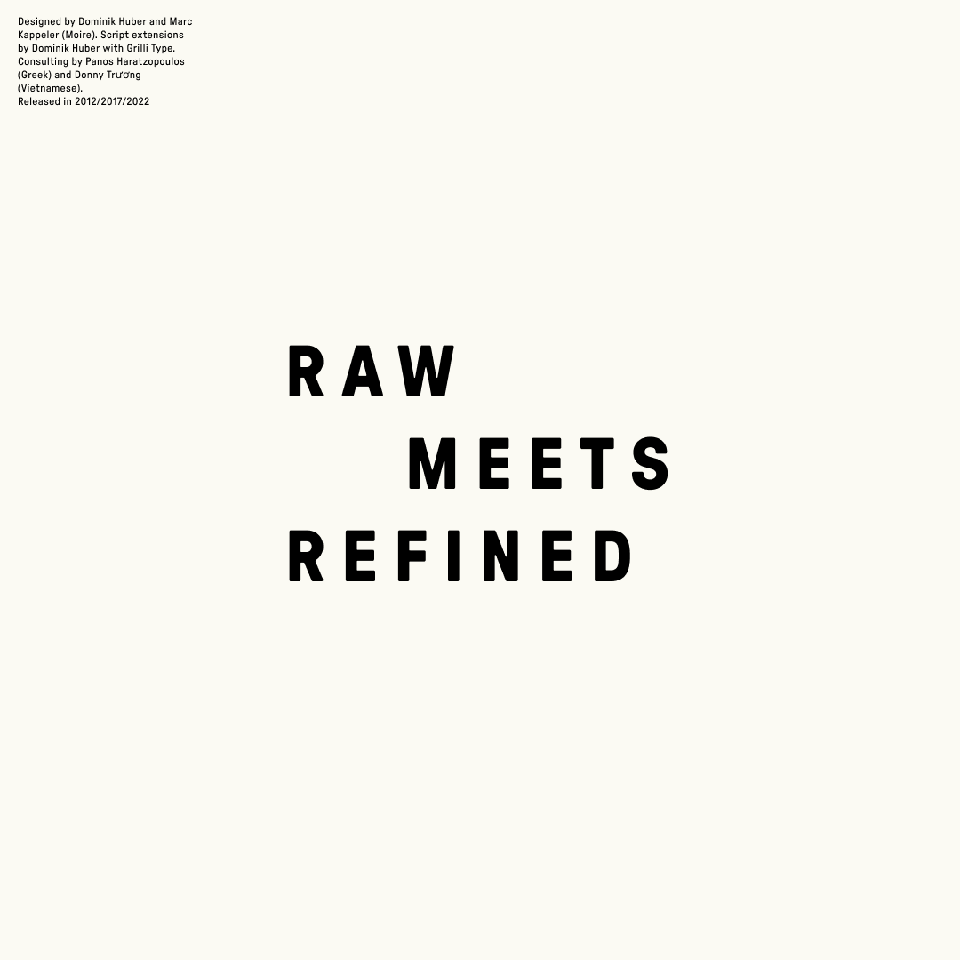
Referencing Red Hook’s naval and shipping history, we chose to use GTPressura for the wordmark and typeface for the microsite. From Grilli Type’s website:
GT Pressura is inspired by metal type printing history as well as engineered letters stamped onto shipping boxes. It uses the visual gesture of ink spreading under pressure as a stylistic device, offering an alternative to more spindly typefaces of the digital age.


Credits
2022
2022
Creative Direction
Simon Chong
Design
Melissa Miyamoto-Mills
Abigail Wallhauser
Copy
Carter Bird
Simon Chong
Design
Melissa Miyamoto-Mills
Abigail Wallhauser
Copy
Carter Bird