Role
Senior Designer
@Gretel
Senior Designer
@Gretel
2022
Brand Refresh
Visual Identity System
Motion Identity
Brand Refresh
Visual Identity System
Motion Identity
Curology Brand Refresh
Curology is a beloved direct-to-consumer brand that brings dermatologist approved and personally customized skincare right to your door.
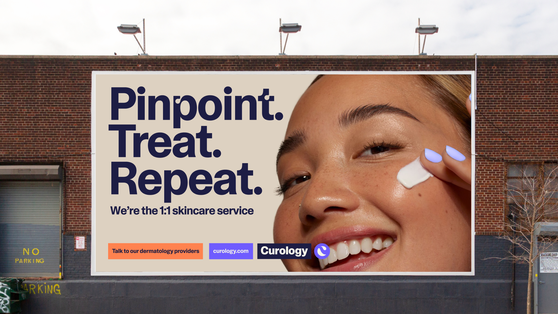
At Gretel, we were tasked with refreshing the brand from inside out — creating new guiding principles, tone of voice, and a ownable visual identity. The challenge and joy of this project was striking the balance between personalization and science. At it’s core, Curology products should inspire a sense of confidence.

Strategy
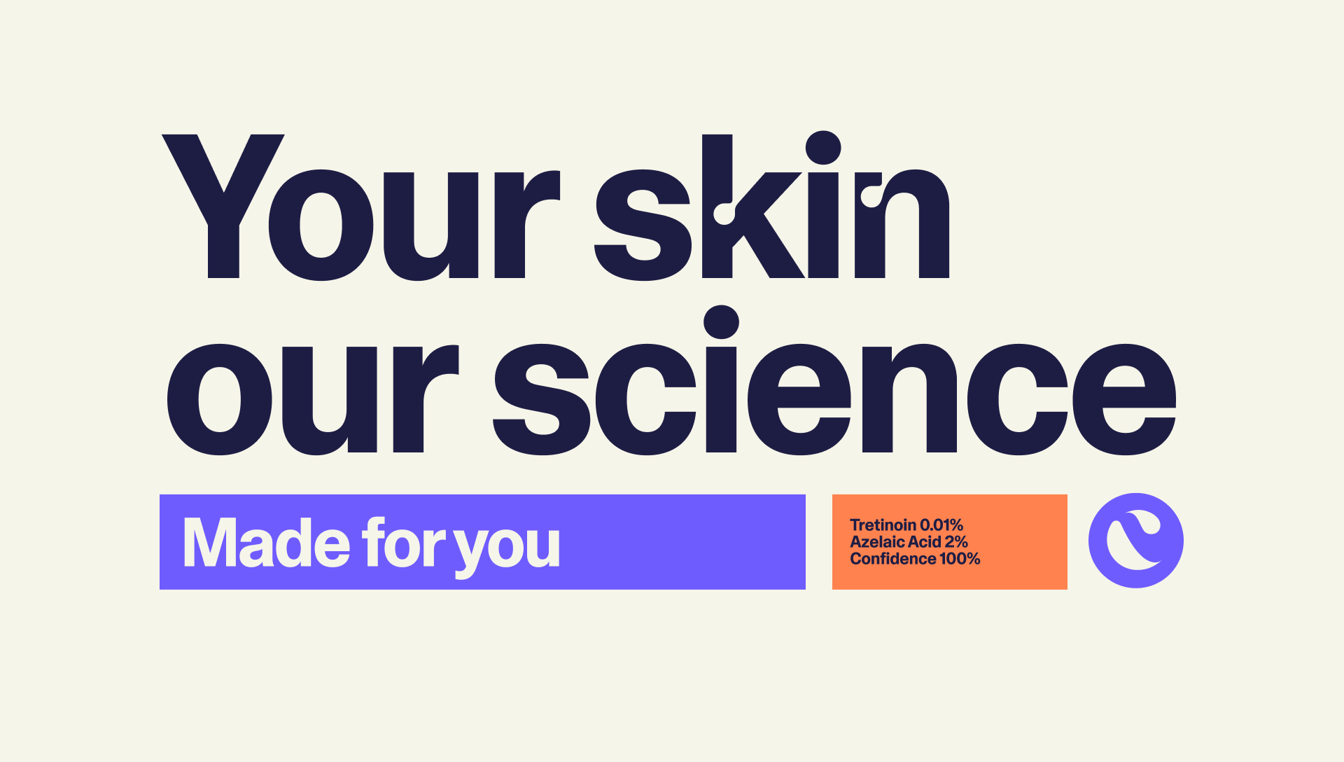
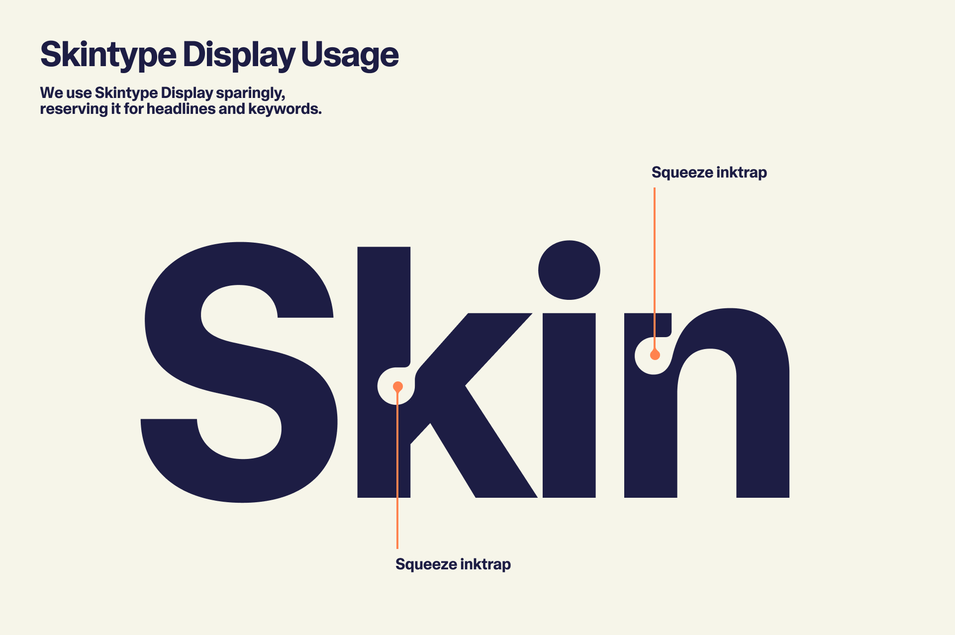
To strike the balance between approachable confidant and studied dermatologist our tone of voice was direct and friendly. In step with the strategy the typography (perfected by our friends at Dinamo) featured a display that’s ink traps mimicked skins imperfections as a defining characteristic.
A swiss-inspired take on layouts keep information clear and legible while we infuse personality though color and animation. The ink traps of our custom typeface “Curology Skin Type” inspired the entire graphic language that speaks both to skin and the products that we apply.

Modularity & Motion
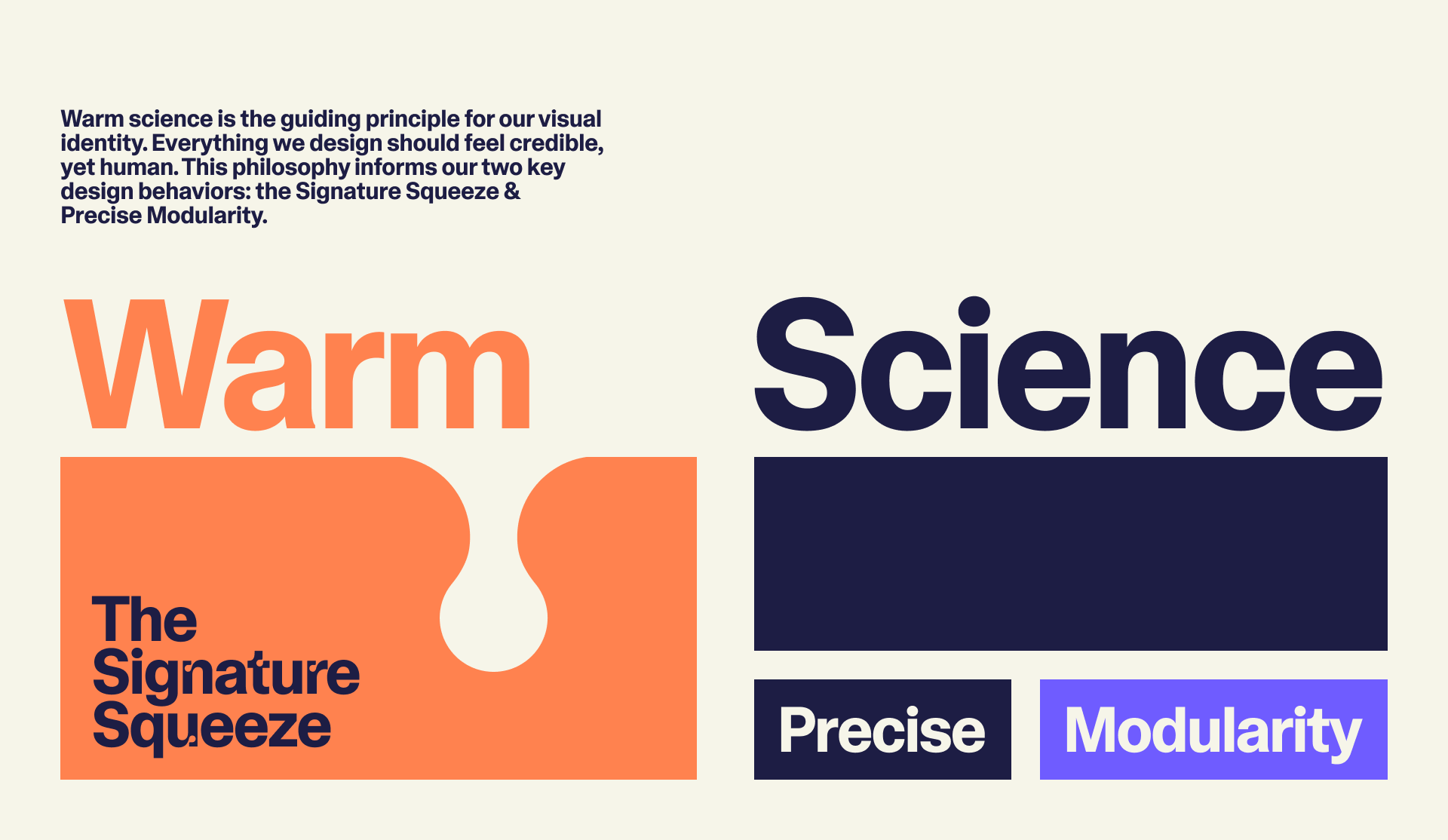
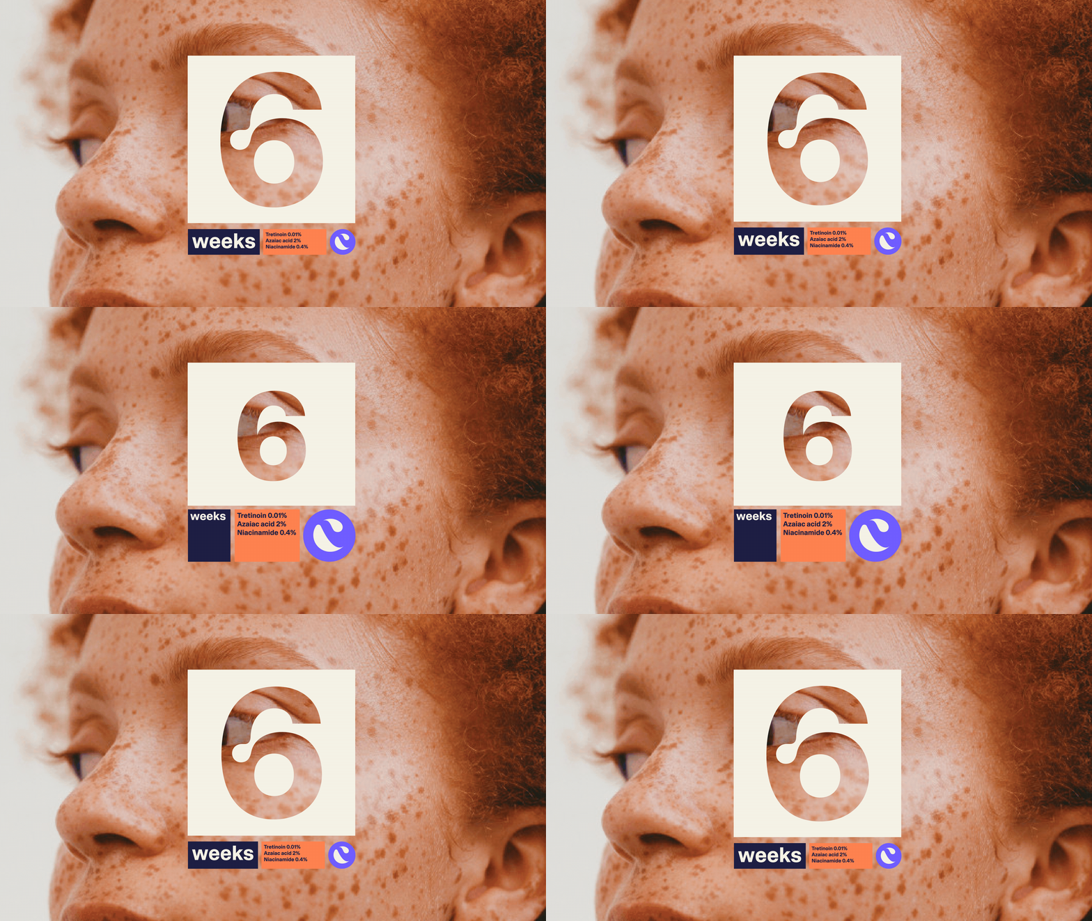
It made perfect sense to represent personalization with a modular system. Skincare has to be adaptable and something that is easily fit into one’s routine. Using a modular system allows the design to flex to equally represent a regimented order but also a human touch as the modules playfully scale into place.
![]()
It made perfect sense to represent personalization with a modular system. Skincare has to be adaptable and something that is easily fit into one’s routine. Using a modular system allows the design to flex to equally represent a regimented order but also a human touch as the modules playfully scale into place.

Credits
2022
Client
Curology
Studio
Gretel
2022
Client
Curology
Studio
Gretel
Strategy
Kasia Galla, Director of Strategy
Design
Andrea Trabucco-Campos, Creative Director
Flick Ericksson, Accociate Creative Director
Andy Keating, Associate Design Directior
Beth Johnson, Senior Designer
Melissa Miyamoto-Mills, Senior Designer
Ellis Zhixuan Yu, Junior Designer
Motion
John Choi, Senior Motion Designer
Type Design
Dinamo
Production
Lynsey Petruskevich, Senior Producer