Role
Art Director
@ Spotify
Art Director
@ Spotify
Art Direction
Design
Design
2024 EQUAL — Platform Refresh
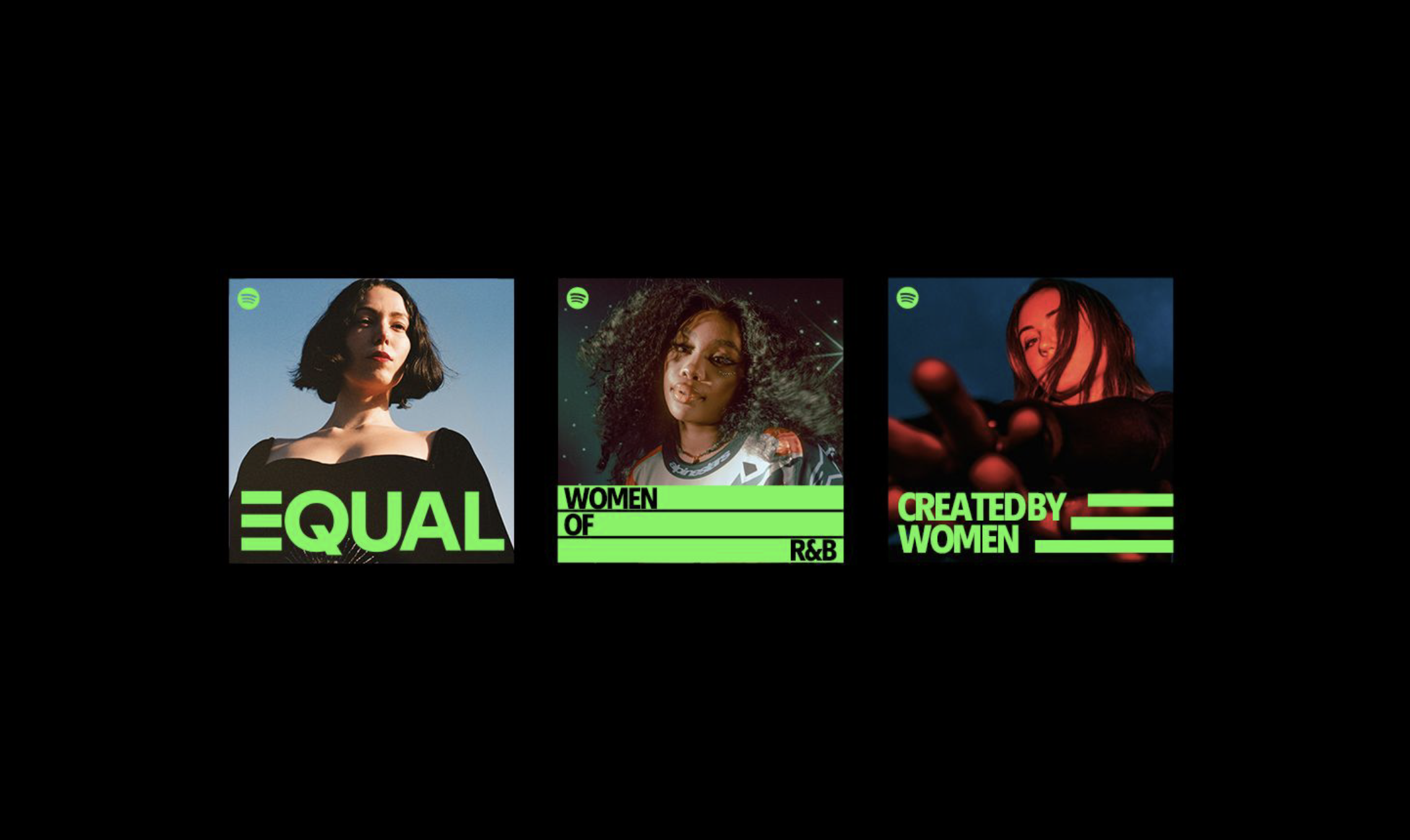
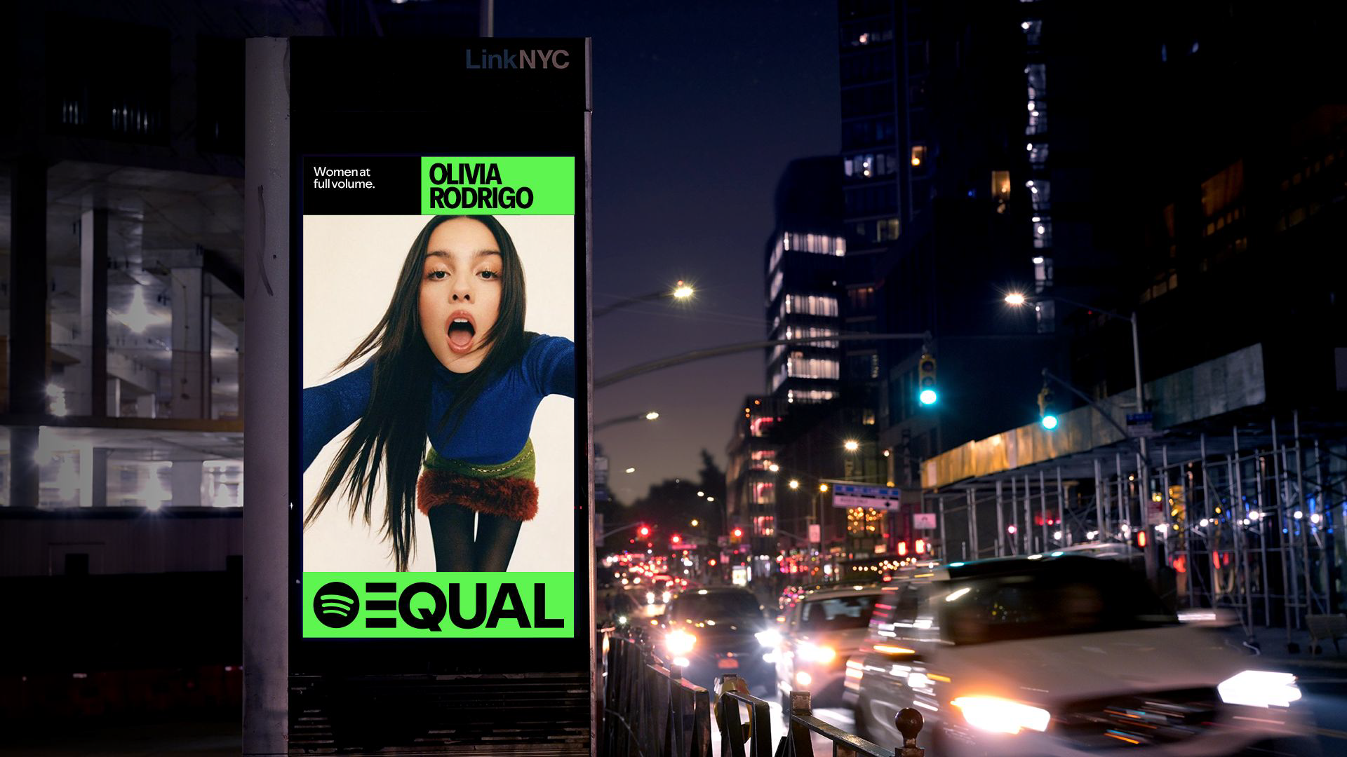
EQUAL is a Spotify initiative to fuel equality in the music industry. This global Spotify program supports women music through education, inspiration and networking opportunities. We platform women at full volume and are commited to creating equity on all our channels.
EQUAL launched with a simple yet bold and unapologetic design system in 2021. With the introduction of Spotify’s typeface ‘Spotify Mix’ in 2024, we took the opportunity to refresh and expand the EQUAL visual identity as its global community continues to grow.
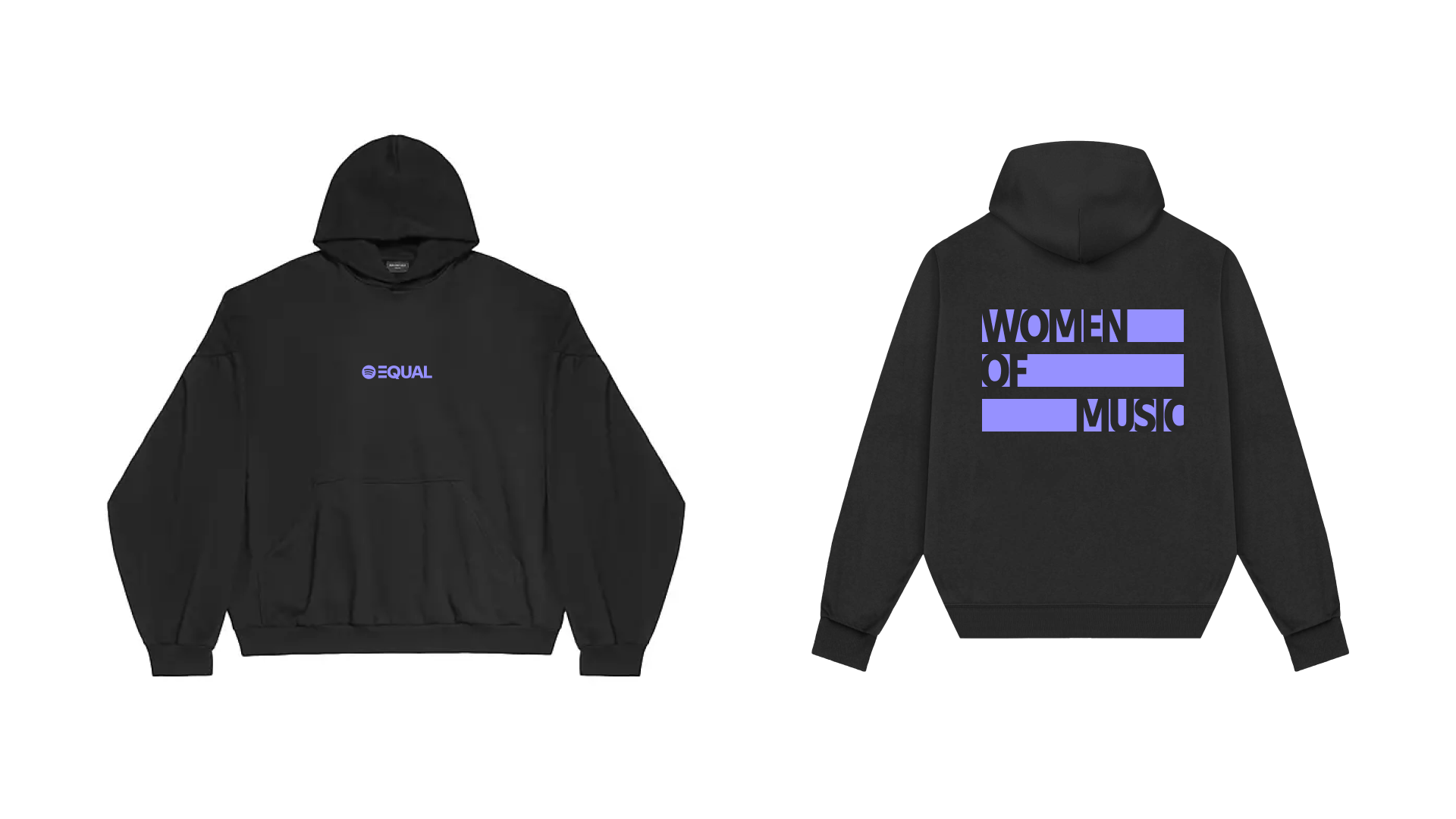
I was asked specifically to develop a flexible graphic system that could easily extend to motion and live events, including printed collateral and conference branding.


Expanded Palette
Whenever possible we continue to use our flagship colors — neon green and black. However as we continue to create programming for the EQUAL platform we created an expanded palette to be used for events, specifically when color matches for neon green could be challenging.
It was very important that the colors matched the attitude the neon green so successfully established. Extending the palette created more ways to bring the brand to life off platform in readily available printing processes.


Credits
2023
In-house
@Spotify
2023
In-house
@Spotify
Design & Direction
Ellen Pai, Brand Design Director
Melissa Miyamoto-Mills, Art Director
Motion
Vero Gomez, Animation Lead (Contract)
Brand Experience
Claire Ulak, Brand Experience Lead
Ellen Pai, Brand Design Director
Melissa Miyamoto-Mills, Art Director
Motion
Vero Gomez, Animation Lead (Contract)
Brand Experience
Claire Ulak, Brand Experience Lead